instead of a plain white background on my front cover i wanted to design a graphic that is on the background using the colours which people most associated with a rock magazine. i want to do this so that it stands out from other magazines and also to make it appealing to the audience by making it something to relate to rock music. after experimenting on Sumo paint i have played around with different designs and shown some of my experiments below
i have now designed a final graphic to feature in the background of my magazine front cover
the process of making this graphic was done on sumo paint, a free online service similar to paint but with extras such as a symmetry tool which came in handy when creating,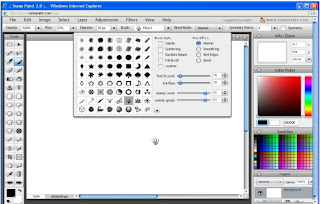

i started off with one of the pre-set brush tools,and i chose this one as it curvy and looked like small sprouts of grass and as my magazine is called paradise i related it back to a hot summers day on a grass field.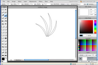

Next i enlarged it to its maximum size and turned on symmetry with 6 symmetry points and positioned the brush near the right of the page, but not so far out that the edges wont touch.
the colour i choose to do this first was black just so that it would give me a strong basic idea of what it will look like and i thought that i could experiment with colour later. I clicked the brush a few times to get a nice strong tone.
after i started to add colour to it and i decided on three main colours, black, red and white seeing as these colours were picked as good music magazine colours in my survey which i conducted.
after adding the black i decided that the red edges needed to look a bit transparant as if it was fading so i overlay a few layers of thin white to add a low opacity feeling to the edges.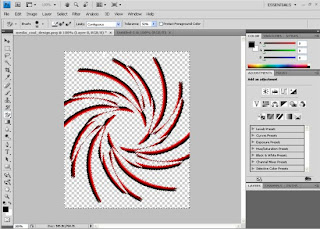
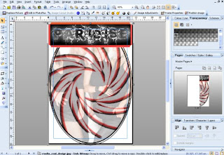


I put it on photo shop and made it have a transparent background, after seeing how bad it looked as an overlay.
After trying the graphic overlaying the photo I can see thaat it does not look good and need to incorporate the image in a better way for it to work with the whole music magazine i will try cuting out the image and making the background transparant and placing the graphic behind it.
after trying the graphic behind i have decided that it looks better and more professional and it also provide the idea that this graphic could be used every week with just different bands and people placed over it
next i had to work on the master head and i started out with a font that i downloaded from dafont, called INFECTED after constructing a survey from various fonts which i liked, (which can be seen in the previous blog post) i loaded it up on photo shop and experimented.
I started by highlighting all the black in and around the text because this is what i want to change as it seems too plain.
I then clicked on the refine edges button at the top and wasn't sure what it did but was intrigued into what it did.
i started by selecting the black button at the bottom in which inverts the colours
then i increased the radius from 0 to its maximum of 250 and this gave it a sort of white glow around it and made it seem to be more transparent and fading out
i then increased the feather but it just blurred it and i didn't like the effect
i increased it further and it just made it unreadable, so I changed feather back down to 0
after putting the feather back down, tried increasing the smoothness and i liked outcome as it looked like it had been painted on and it looked to be multi layered but after getting feedback from people they seemed to criticize it of being a music magazine master head and thought that it did not work for my media product
after changing it back to what it was before, i still felt like something was missing and so i thought about some sort of pattern or design so i had to click OK to accept the settings, but when i did it went back to how it was before so if i was going to get this on my magazine i had to think of a clever way of doing it
again i highlighted all the black on the text so that when i add a pattern it would only show up on the black and not go over the edges
i started by selecting the brush tool and scrolled through the different brushes and liked the star one
so i set the colour to white and stared clicking a lot randomly and immediately liked the effect it bought so i touched it up with a few cleverly placed stars to complete the effect
i then went back to the refine edges and repaeted my steps again in order to get the effect i liked before hand
i then printscreened it and copied it into paint and saved as a JPEG file, and then opened it in page plus
when putting this on it was boxed in a rectangle but i decided to curve the edges as it seemed smoother and made it look more professional.
i then changed the line round it to 0 so that it looked smooth and placed on like a sticker
on this one i have just added the side box on the left hand side which will home the sub stories and will consist of 3 picture a small amount of text information about them to hook the audience
starting to develop my contents page


No comments:
Post a Comment