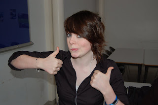
i chose this top picture to work with as she was doing an angry face and look scarier and this was her image she was trying to portray as her music is hardcore.

I didn't choose this as she looks bored and there is no emotion in the picture
this photo she seems sarcastic and its a bad pose
 i used this for my double page spread as she seems to be natural and relaxed and she is over to one side more so i can put the text boxes to the right side
she seemed to posed and i not being serious enough for it to relate to her type of music.


No comments:
Post a Comment